Get the latest tech news
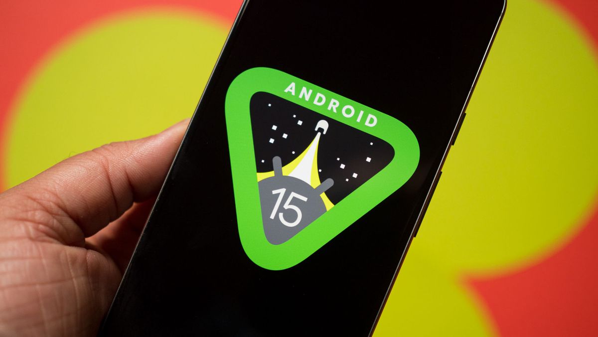
Android 15 might boost app readability as a 'color contrast' menu is spotted
This settings page would give users the tools to customize their phone's experience to their liking.
A dive into Android 14 QPR3 Beta 2.1 shows Google is working on a new "color contrast" settings page to boost app readability. The page, tucked inside the beta's code, would let users alter the contrast level of "text, buttons, and icons." While we await Android 15, April was previously stated to hold the start of its open beta as we approach its full release later this year.
Or read this on Android Central