Get the latest tech news
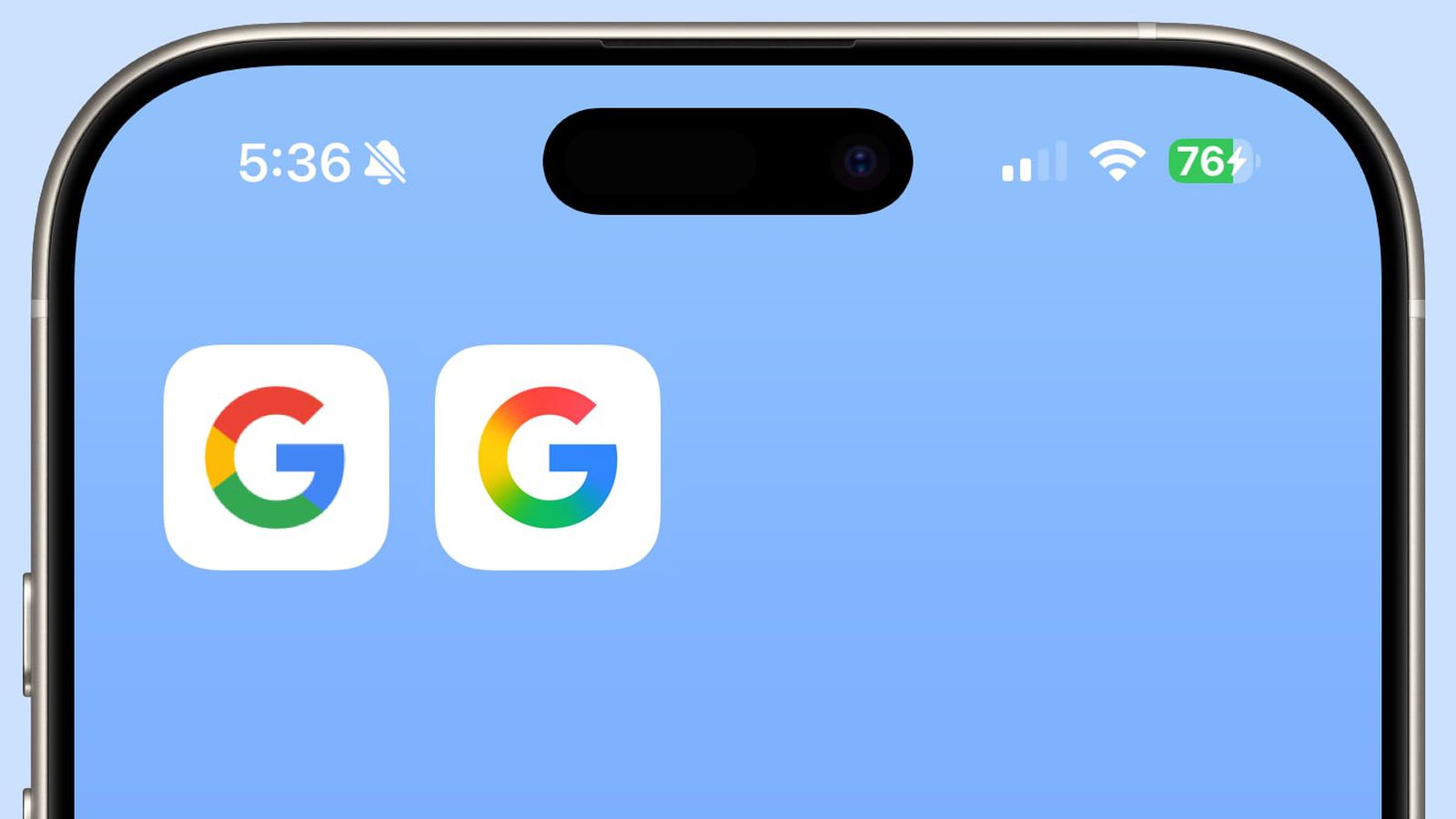
G is for gradient: Google has redesigned its app logo
In some instances, Google's capital G logo now sports a gradient softening the transitions between four colorful sections. But that's the only branding the company seems to have changed.
Over the past few days, eagle-eyed Google users may have noticed that in some instances, the capital G logo for the company now sports a gradient softening the transitions between the four solid-color sections. But perhaps notably, the branding for Google's Gemini AI assistant does have a slight gradient on its star symbol. Whatever the reason, the biggest surprise isn't that Google may be rolling out a logo refresh, but that the change seems to be happening with zero fanfare.
Or read this on Endgadget


