Get the latest tech news
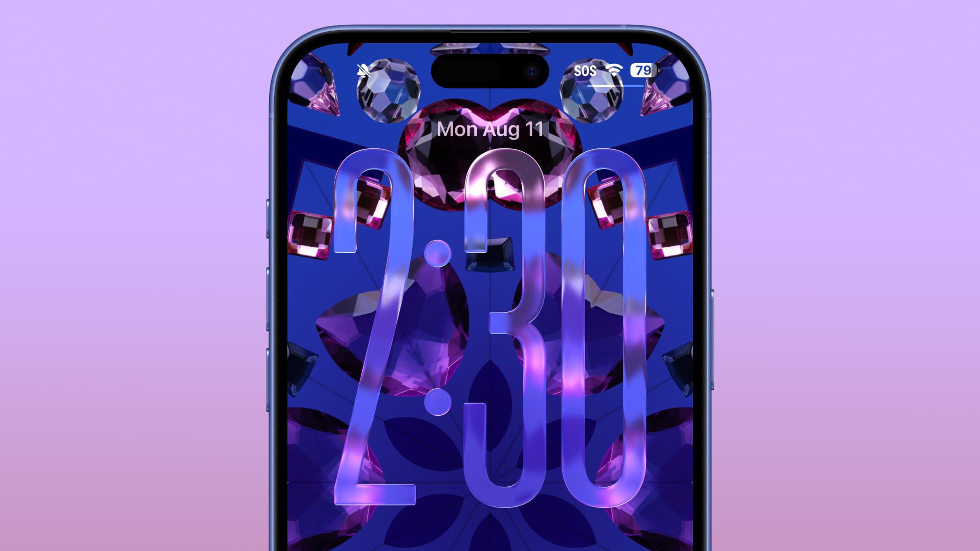
Through the Liquid Glass
How Apple’s Liquid Glass is reshaping UI and what it means for icon design
It ends a decades-long tradition of expressive, frame-breaking icon design, where transparency allowed for odd shapes, soft edges, and the occasional rebellious detail that reached beyond the grid. While I mourn the loss of transparency and unique app icon shapes on the desktop, I also fear that applying a single visual effect consistently across a big system is problematic. It mixes personal stories with hard-earned industry lessons, from craft to chaos, from product principles to taboo startup truths.
Or read this on Hacker News